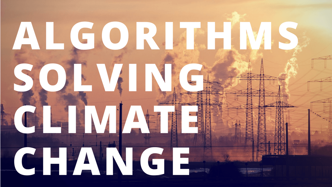
The Secret Algorithm Leonardo DiCaprio Can Use to Solve Climate Change Once and For All
In this video, I walk through a recent Bloomberg study showing that CO2 emissions are indeed the cause of Climate Change. Then, I do my own analysis look...
Tips about using Tableau to maximize the value from your data. Learn how to make beautiful data visualizations that actually mean something.
In this video, I walk through a recent Bloomberg study showing that CO2 emissions are indeed the cause of Climate Change. Then, I do my own analysis look...
Today was the Tableau Conference 2016 Keynote where they announced a new product vision and demonstrated many upcoming features. While I couldn't attend ...
It's been nearly a full year since I purchased my Tesla Model S. In that time I've completely fell in love with this company, their mission, and most of ...
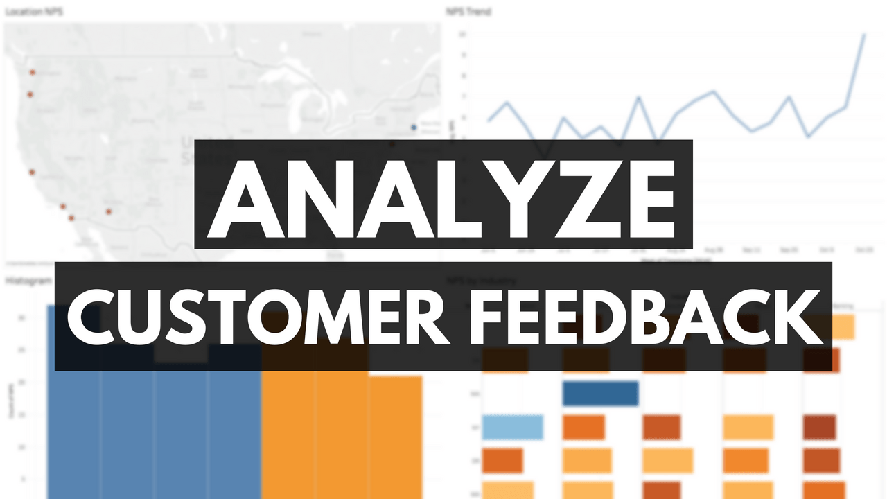
In this tutorial, we're going to learn how to Analyze Customer Feedback is a key step in any good business strategy. From understanding customers needs to learn...
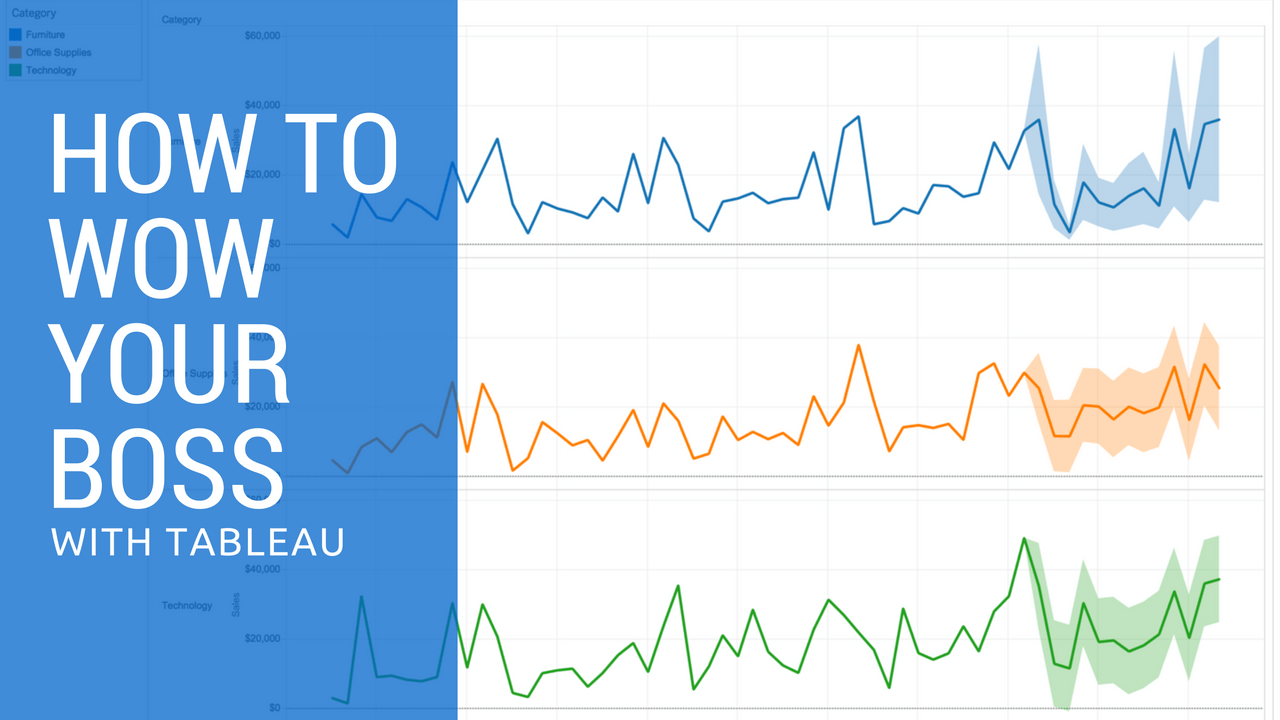
I've been an advocate for Tableau's BI and Analytics software for nearly 6 years now. It has given me the tools necessary to help dozens of clients trans...
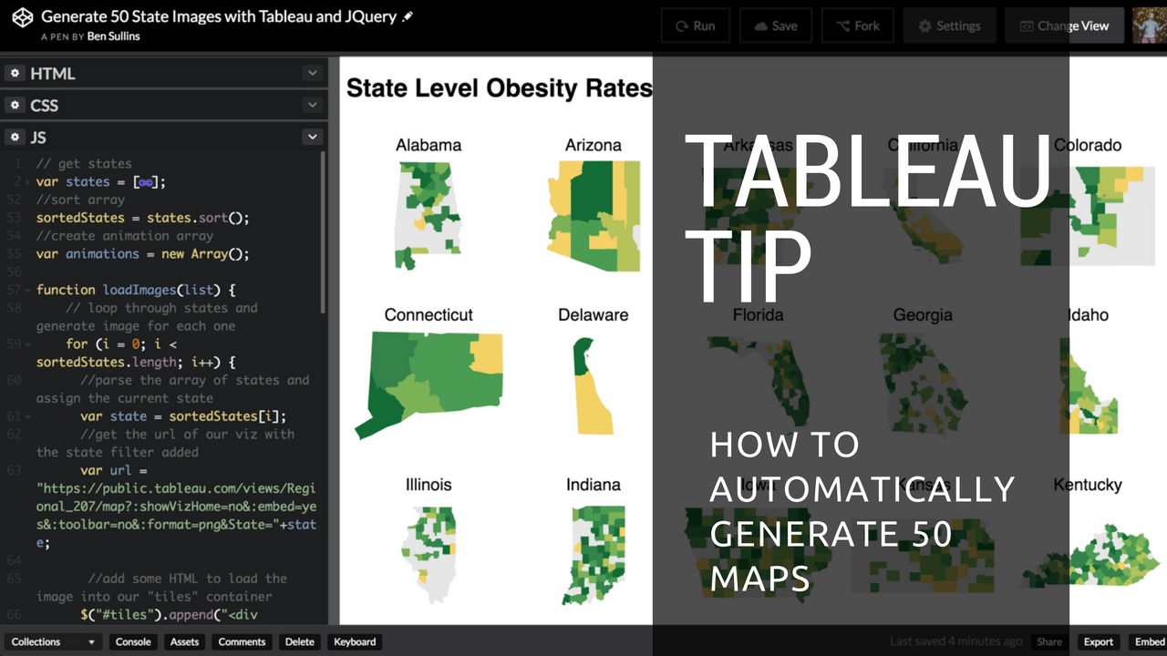
Recently I feel in love w/ the small multiples types of graphs that show each individual state level metrics separated into a grid style layout. This isn't new,...
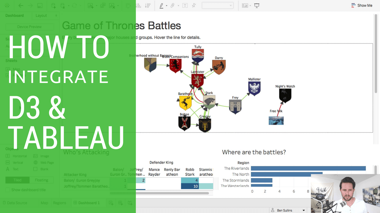
I love Tableau but sometimes, it can't do everything I want it to. That's when I typically turn to D3. By being a natural web platform, D3 allows you to create ...
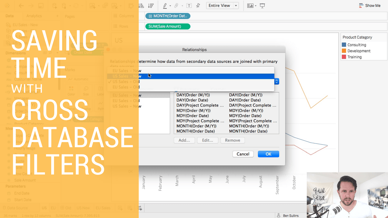
For a long time now when you wanted to filter multiple data sources you'd have to use a parameter in Tableau. This worked well but had is not without its own li...
Today I'm announcing a new side project I stood up aimed at helping people create more compelling visual stories online. This project, VizBin, is a utility for ...
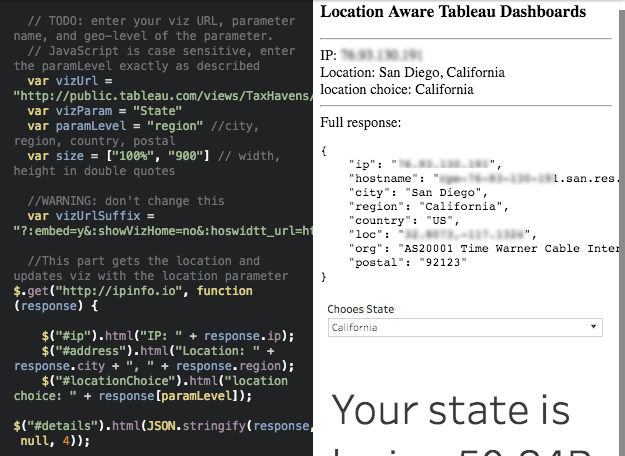
One lesson I learned a long time ago was that we are all vain when it comes to data viz. Generally, we all care more when a data viz is about us. I've seen this...