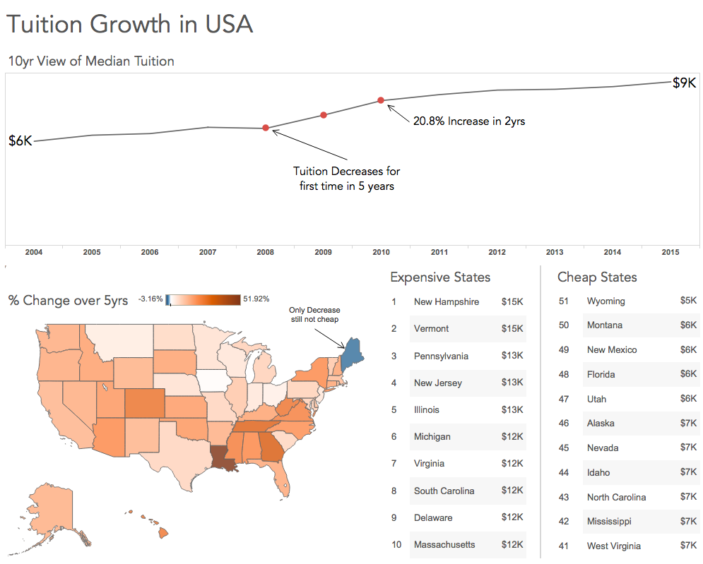
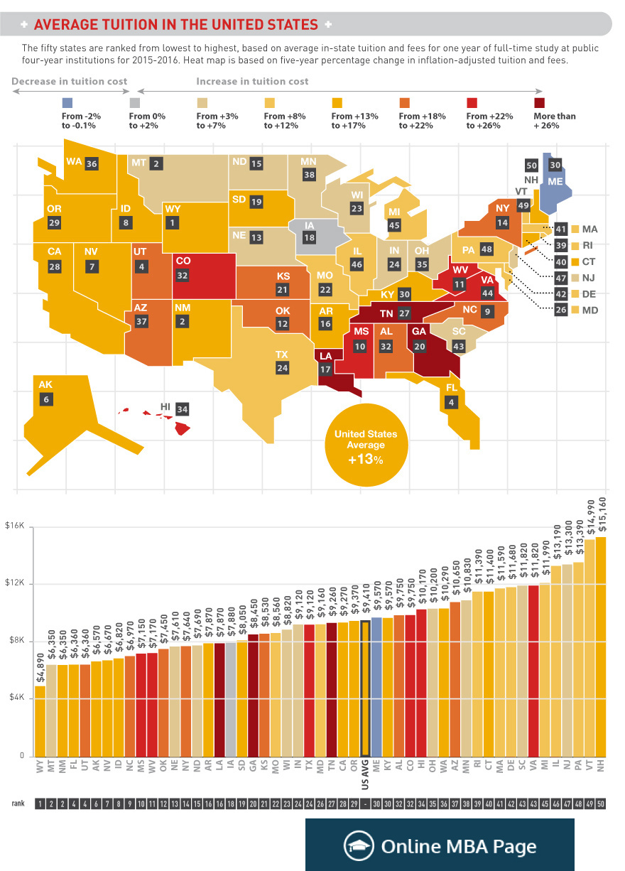
This week's makeover comes from Online MBA Page in their article describing the growth of tuition for college in the United States. This article has some interesting points for sure, and the data is compelling. I suggest going to read the full original article here: Average Tuition and Education Attainment in the United States
My goals of this makeover:
- Reduce the chart-junk
- Highlight the period of high growth between 2008-2010
- Show which states are cheapest and most expensive
Original
What Worked
- Map shapes are good
- Color scale makes sense
What Didn't Work
- Too much chart junk, remove labels, soften legends, remove gridlines
- Too much color, focus on softer tones
What do you think? Was my makeover better or worse?