When presenting information how you frame it matters. To illustrate this point we're going to compare how FiveThirtyEight, one of the best data news sources, changed their framing between the US Presidential election in 2016 versus the US Mid-Term election in 2018.
Contents
Using Percentages
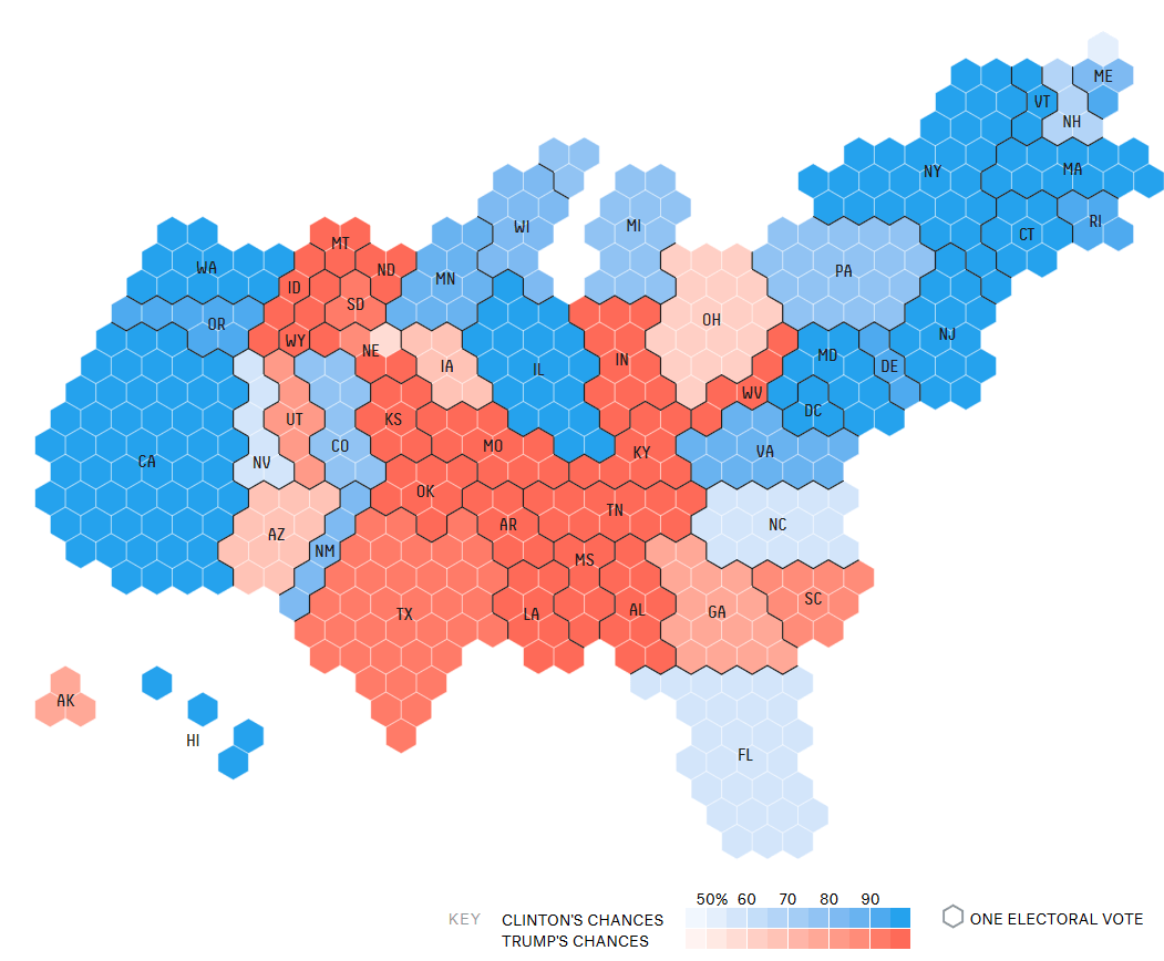
First, let's see how they framed the race for president between Hillary Clinton and Donald Trump
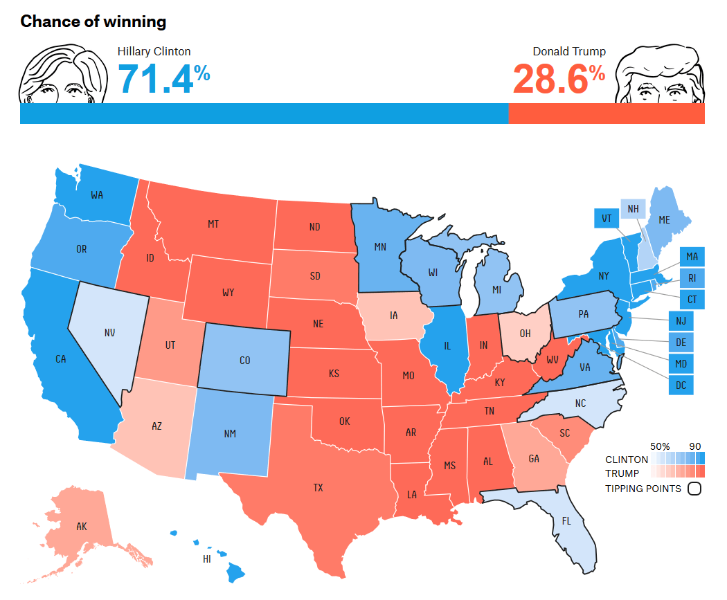
From this data visualization (or just viz) we can see that Hillary Clinton has a substantial chance of winning the presidency. Of course, we all know the outcome here, but the point I want to make is they framed this viz using a % chance to win, which leaves the reader, you, with interpreting how likely that is.
Trending the Forecast
In addition to this viz, they also had a line chart showing how their forecast for the winner has changed over time leading up to the election night.
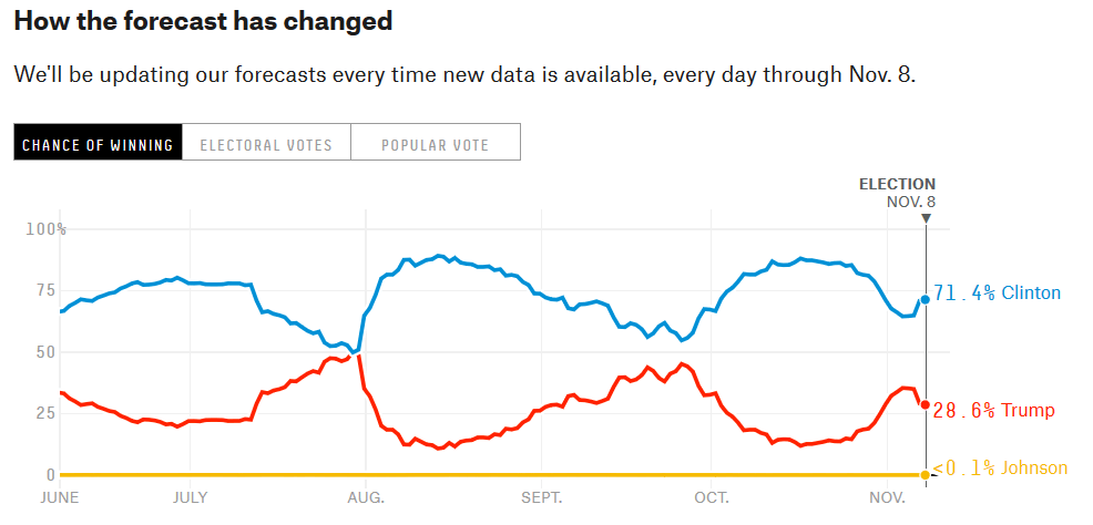
Again they chose to use percentages as the frame, or scale, to describe a candidate's chances. This again leaves you thinking how likely is 28.6% versus 71.4%? Could it be possible that 28.6% is a meaningful chance? If you're like me a 28.6% chance of winning sounds highly unlikely and yes, like me we all assumed wrong about that.
Change in 2018
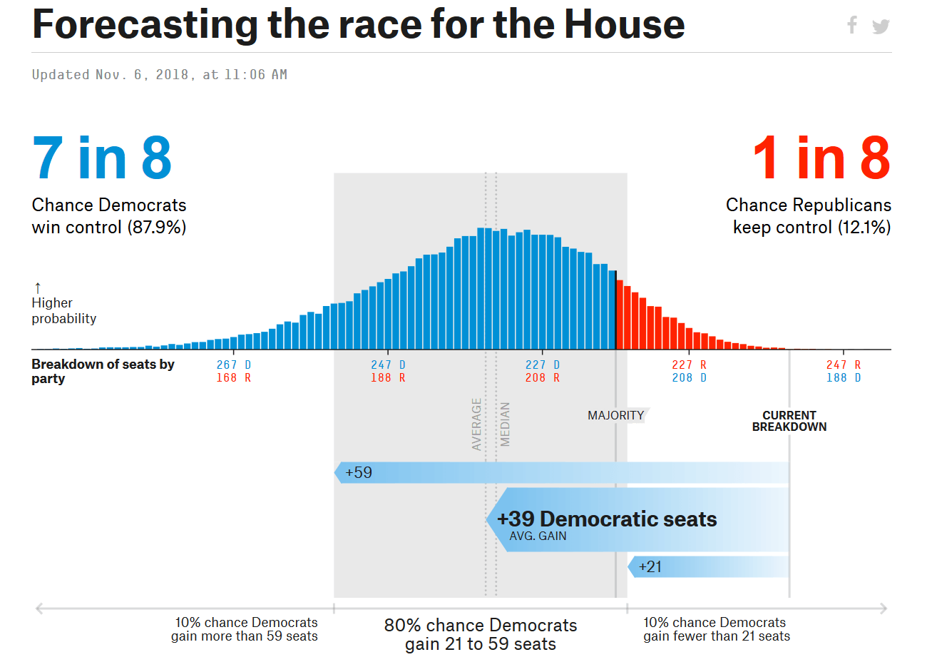
Perhaps this confusion is why they changed their method in the 2018 Mid-Term elections. Below, they shifted away from the percentage chance to win and instead opted to frame that number in a way that is easier to comprehend.
Framing Data in Maps
In this chart, they decided to show the chances of Democrats winning a majority of seats (votes) in the House of Representatives (House). Notice they also listed the percentages but this time as sub-text under the 1 in X chances of winning. I find this to be much easier to understand as well as communicate. For the US 2018 Mid-Term election they also included an excellent visualization that lets you see the individual districts in a cartogram.
A cartogram is an excellent way to show data that has spatial significance, where the values located in relation to each other, but without the distortion, you get from sizing the shape to match the actual land mass.
Again it's about framing.
For example, when you look at a map of the US, some states are larger than others. And while that may have significance to your analysis (e.g., land size), it often distorts the data. To put a more delicate point on it, Texas has two senators just like every other state in the US, however, because of the sheer size when using a map Texas appears to have more power than our smallest state, Rhode Island.
FiveThirtyEight included a cartogram for the 2016 US election as well, but it was further down the page below the fold.
Framing your data matters. Our visual perception system in our brain assumes larger shapes have more significance than smaller ones. 28.6% chance sounds extremely unlikely, yet it's 1 in 3. All of these decisions on how you present data have an impact on your audience's perception of the meaning in the data. Take care to ensure when presenting any information that you frame it correctly so the purpose buried in the data can shine through.
Lastly, I have tremendous respect and admiration for the team at FiveThirtyEight. Their work is the best in the data journalism industry so please do not take this as a knock against them. I merely observed this difference and wanted to call it out as a lesson for anyone looking to present data now or in the future.
If you want to learn more about this, consider signing up for my online learning program at Free the Data Academy where I share my 20 years in the field of data with you and help you start and elevate your data career.
Talk soon!
Ben