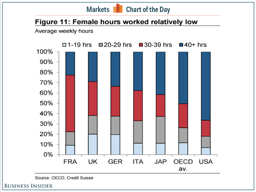
Women in the Unites States are some of the hardest working in the world. A recent article from the UK Business Insider made this point when they posted a chart by the OECD here (link)
Their chart had great data but unfortunately was also full of chart-junk. This made it hard for the message to shine through, although the journalist found it pretty easily, so maybe I'm wrong and it's fine 🙂
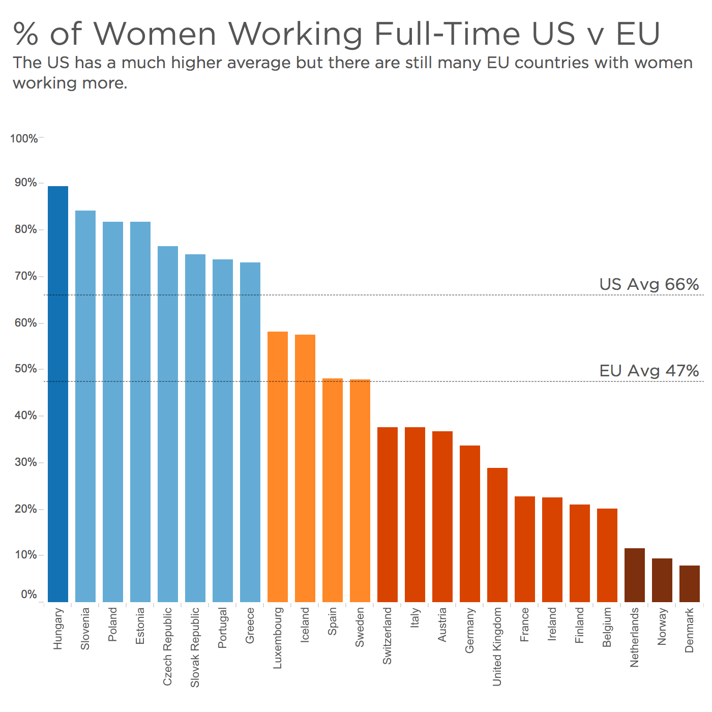
My makeover above consisted of converting the hour bands to only be the 40+hrs/week so that we can focus on full-time working women. Then after many iterations and one peek into hell (do not click here) and I ended up with a simple color-coded bar chart.
I think this chart clearly shows the message that yes, women in the US work harder than women in the EU on average, however, there are still a number of countries in which they work much harder.
What is going on Hungary?!
What do you think? Is there a reason for this, is it a socio-economic thing (whatever that is) ? Let me know in the comments, cheers!

