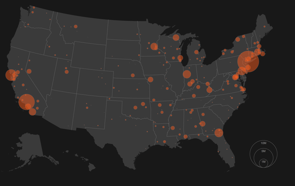
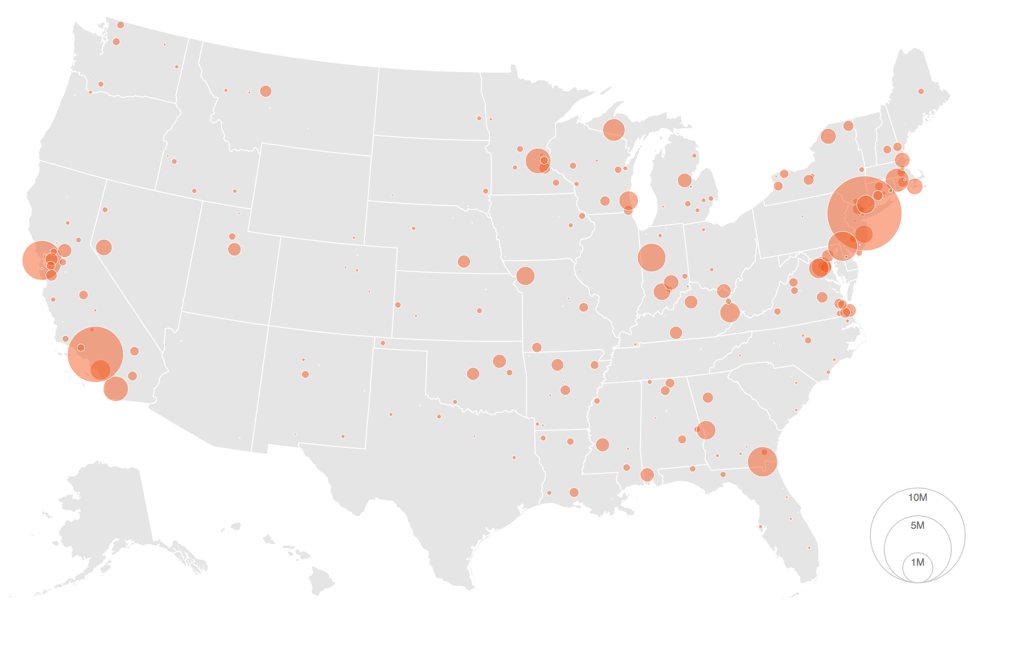
Maps are a visually engaging and often compelling way to communicate with data. There does seem to be a divide however, among the data visualization community on if dark or light themes are more effective. Below I've compiled a map with both light and dark themes to compare and contrast their effect on your visual perception of the data.
So the question is, which one speaks to you?
Further Reading
- Cole Nussbaumer Knaflic has a great post on the considerations when using dark backgrounds
- Stephen Few's thoughts on background options
- Rochelle King has a great TED Talk about how they came to use a dark background for both Spotify and Netflix

