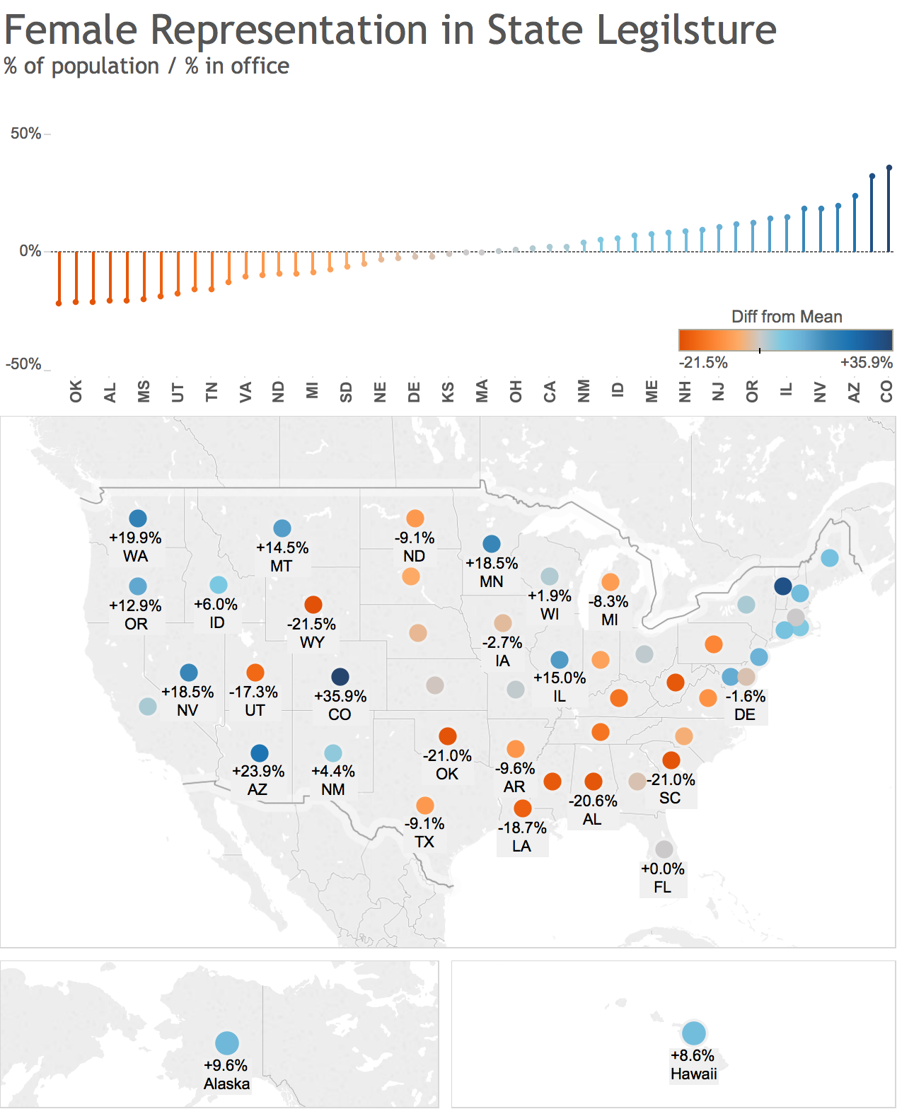
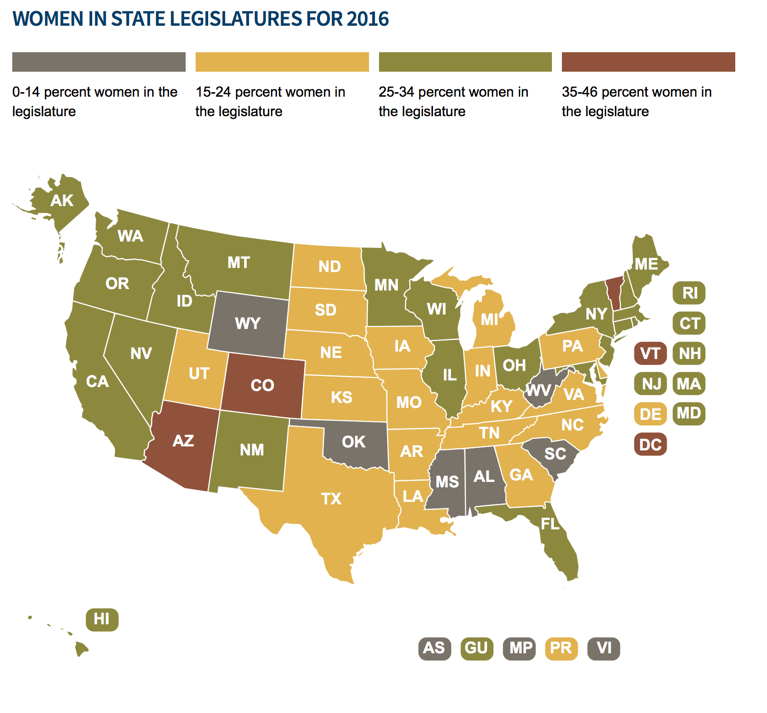
This weeks makeover comes from the National Conference of State Legislature where they show a map of how many women are serving in office in each state.
This was some interesting data for sure! After digging in I decided to focus on the comparison of the % of women representation in state legislatures compared to the national average as well adding a bar chart to show the comparison among states.
Click here for a live interactive version on Tableau Public and let me know what you think!
Original Data Viz below (src)

