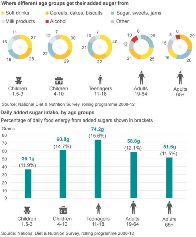
This weeks Makeover Monday is sourced from a BBC article (src) describing the new Sugar Tax going into effect in the UK. The goal with this tax on sugar is to fight obesity in the UK, especially among young people (children and teenagers).
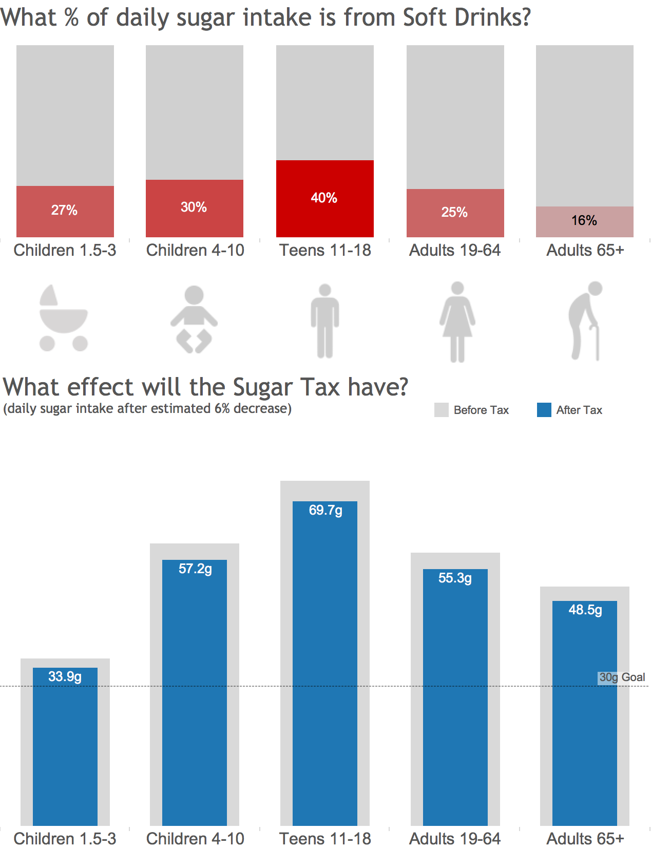
The idea with this data viz is to see the effect of the sugar tax on obesity. The original chart shows interesting data but does not offer a comparison of before and after. This was the approach I took to help the audience understand the potential impact.
Original

The original chart also included every type of sugar source among the different age groups, however only Soft Drinks are being taxed so I decided to de-emphasize all sources besides this one in the top chart. In the bottom chart they show the total intake of each age group currently, but fail to show what the new amounts would be after the estimated 6% drop this tax may have. In the bottom chart I built I chose to emphasize this as well as call out the recommended daily limit of 30g.
Makeover
 Did my version make it more clear the impact this tax will have? Should we be asking “Is it bold enough?” versus “How bold is it?” Let me know below!