This weeks post comes from an article on CNBC about the 21 Century Slave Trade and a new bill passed (HR644) to help combat it. First I have to say how important this article is and that everyone should go read it before scrolling down. Here is the original link:
Contents
The victims of the 21st-century slave trade by Barbara Booth
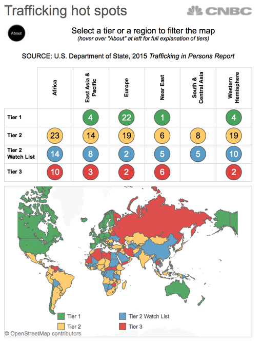
In the story Barbara built a great map showing the levels of human trafficking in different regions and countries throughout the world.
The Original Viz
What worked
- This is a tiny space, and the author did a great job making the viz fit into it and still be legible. In my attempt to replicate this viz I struggled quite a bit with this.
- There was just the right amount of text and viz to make sense of this w/o having full context of the article.
- The highlight table on top used good sized and formatted bubbles to make the numbers stand out.
- The hover over the ‘about' is great and explains the viz very well.
What didn't work
- The map itself I find is just too small to be helpful in this case.
- The colors used for the various tier levels are meant to show comparison when I believe they could have done a better job to show severity. So a continuous scale versus a diverging scale.
My Makeover

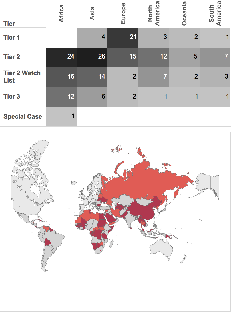
Here I tried to draw focus more to the map and clean up all the clutter of the original viz. In the context of the article I think this would be more effective at communicating the point w/o distracting too much.
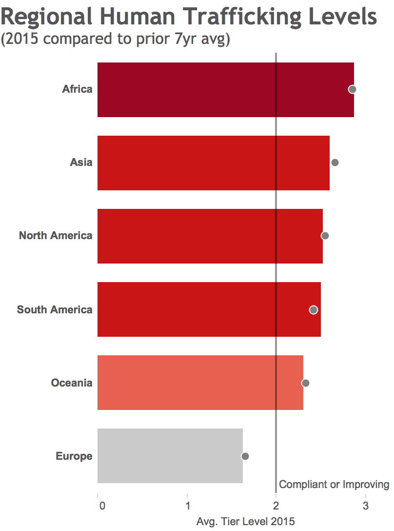
I also thought this wasn't really the best way to visualize this data so I did another version entirely.
My Redux
The point with this viz is that it fits nicely into the tiny space of the article, communicates the main point (no where is safe) and takes minimal time for the reader to consume the data.
I also felt the original viz was lacking a good comparison so for this redux I showed a bubble of the prior 7 years regional average and compared that to the current year. Unfortunately as you can see not much has changed at the regional level.
I'd say the work in this story is important and the original viz is not bad at all. There are just a few things I would have done differently. So what do you think?

