I love getting my hands on new data. Recently I discovered that one of my favorite podcasters, Pat Flynn (smartpassiveincome.com), posts his income statements each month. So you know I had to promptly download all of this data and analyze it!
Contents
Parsing Pat Flynn's Income Reports
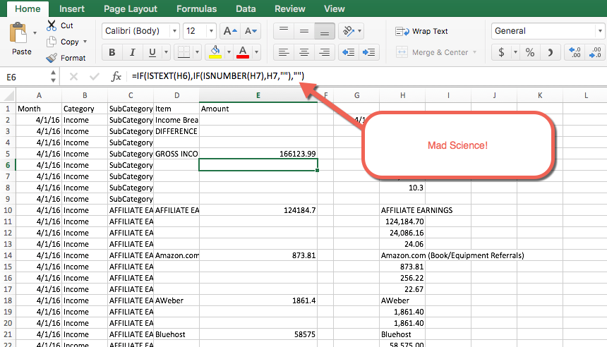
Pat Flynn's income reports are formatted nicely for a human to read, however, when it comes to parsing this data there were many challenges. I'll save you the mad science I had to perform to get the data into a readable format in Excel and provide here the general steps I took.
- Copy/Paste the data from each income report for the past two years
- All of the data was in a single column so I had to parse it into separate parts
- Then I had to create formulas to figure out which rows were headers versus details
- After all of that, I could filter the rows to just the detail data
- Save this as a separate workbook and then import into Tableau
Exploring the Data
Now with the data in my favorite analytics tool, Tableau, I was able to see if there were any interesting bits to uncover. The first thing I noticed was how rapidly Pat has grown his business, great job!
Next, I dug into some of the sources of income and where he's spending most of his money. It turns out Pat is killing it with the affiliate links (Bluehost to be specific) and the vast majority of his expenses go towards his dev team.
There are some good lessons here for those of us following his program:
- You really can make a killing off affiliate links
- Having a good team is invaluable
- You don't have to advertise if you have a strong following
This last one really spoke to me as I've been of the thinking that it takes money to make money. Besides listening religiously to Pat and others in this space like Gary Vaynerchuk and Tim Ferris who constantly remind me that it doesn't take a ton of money, I never really believed it until I saw this data.
Telling a Story with Data
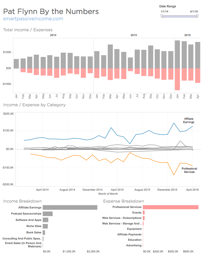
To understand the full picture here I figured a dashboard would do a good job of highlighting the story buried in the data. Below you'll find my first take at Pat's Income Dashboard. reading from top to bottom, if you were Pat, you could see an easy overview of how your income to expenses is trending.
Moving down the chart you could see how the detailed categories were trending, with the top line items called out. Lastly, you have a bar chart breakdown of income and expense subcategories, which is great for comparing the spend / revenue in each area.
I've learned a lot from all the great information Pat has shared and I'm hoping to return the favor with what I know best, making data easy.
Overall I hope this helps inspire you, my data geeks, to go seek out some new data, roll up your sleeves and get to work. I can't wait to see what you create!
If you want to do this for yourself you can! Simply checkout my course linked below and you'll be well on your way to implementing a Data First Approach to Business.
Data Science for Entrepreneurs Day 1 ( free 5-day course)
I love questions, feel free to hit me up on my contact page or in the comments below. Cheers!
Good Morning Ben, I agree with your thoughts that it does not have to take a lot of money to start a business. I started in MLM for a little over $500. I am sure you know what the upside potential of MLM is.
Hi Cindy, yep, you’re right. Great hearing from you!