Let me start by saying the Tesla Model S is the best car ever made. I'm not the only one saying it…
In fact, the Model S actually scored 103 points in Consumer Reports‘ test, requiring the publication to recalibrate the score somewhat since its scale only goes to 100. – ARS Technica
I also love everything Elon Musk is doing to help the world become a better place. So with all that love, I thought I could offer up some more of my own, in the form of a remix of their data visualizations.
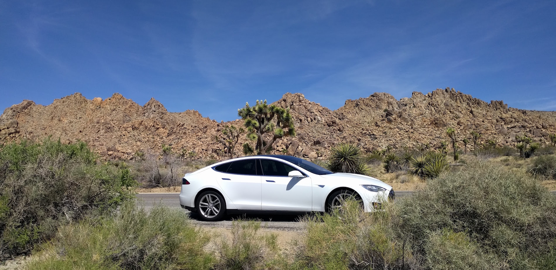
I happen to own a 2013 Model S, her name is Electra (above), and we have had many great trips together in the short time we've known each other.
On a few of those trips, I had my wife take some snapshots of the in-car data visualizations for this post. So here goes, each viz, what it does, and what I might do differently.
Contents
Range Trend and Projection
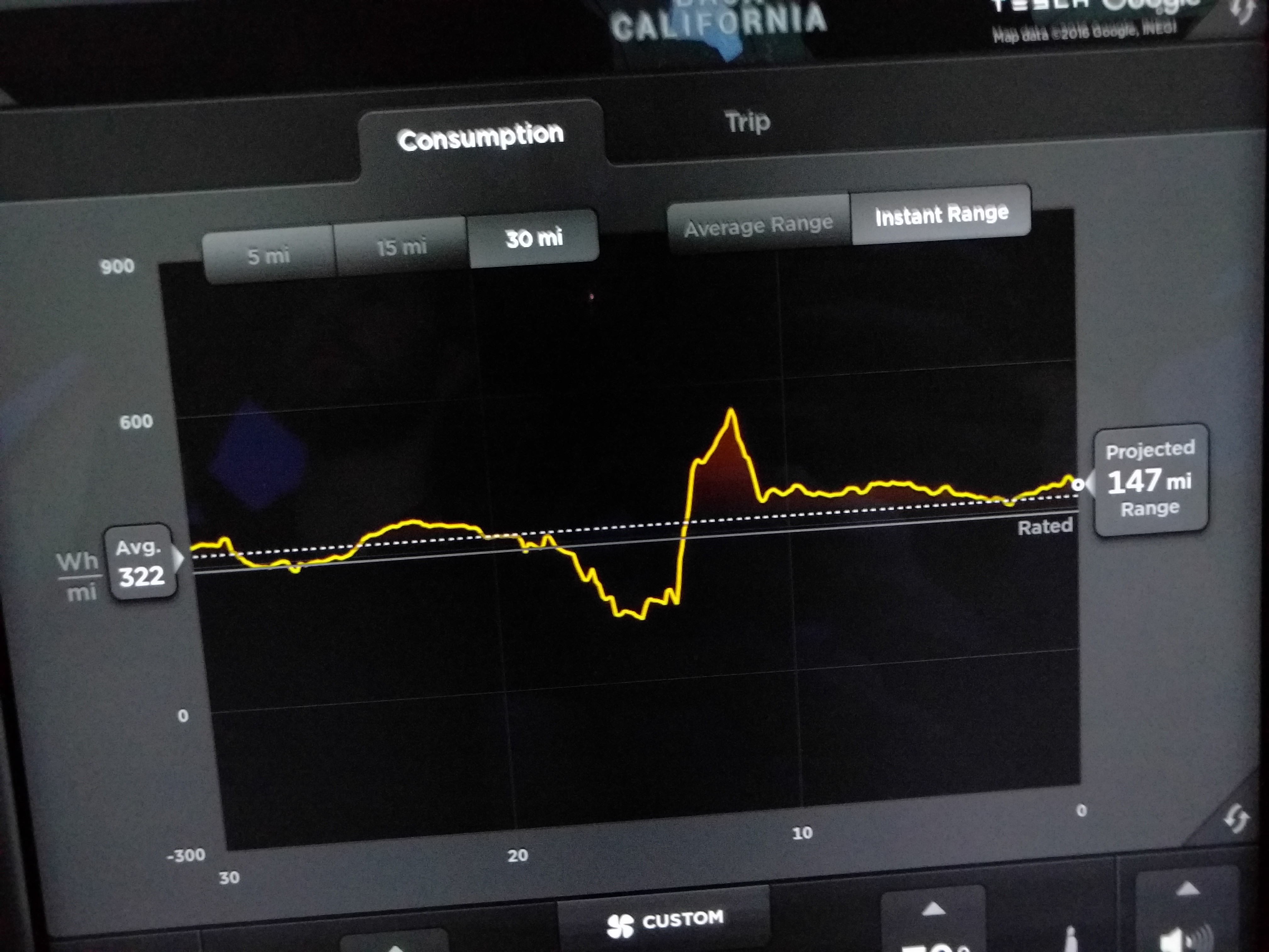
This chart is really great I think. In driving, the one challenge I found was the projection was a bit sensitive to things like hills. I have really high expectations here and would hope that Tesla could improve this by taking into account my route and taking into account hills and even traffic delays. I know this is just V1 so I offer that as a great direction I think this could go and not as a criticism of the value, this is really effing awesome!
Main Dash in Tesla Model S v7.1
The main dash is beautiful and I love how it adjusts based on what I'm doing in the car. For example in this shot, I had navigation going but in other cases, I might see album art on the left side for the current song playing.
Overall I think this is a great layout, but the fonts and perhaps colors could change. For example, maybe change the brightness of certain colors based on where you want the drivers attention to focus, say if they're speeding perhaps?
Trip Metrics
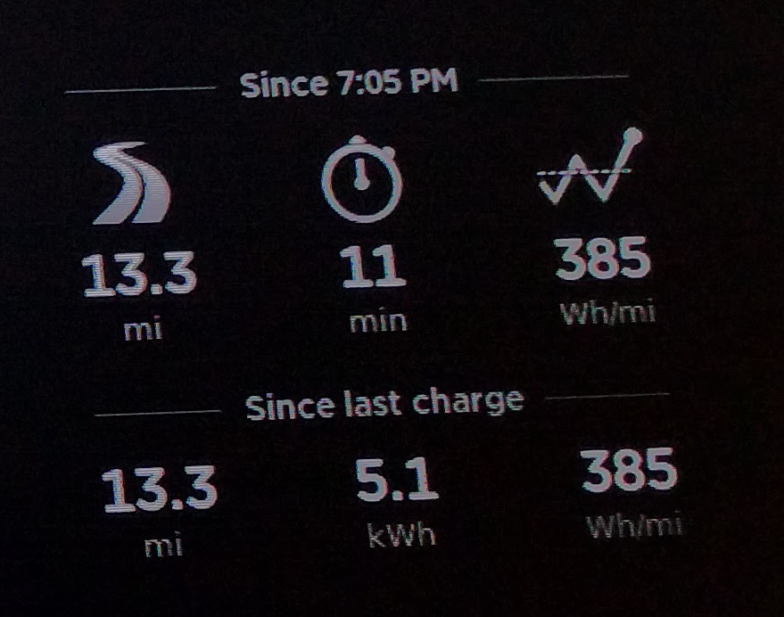
These metrics really do serve a purpose. Often I'll be driving home from somewhere while my son falls asleep in the car and I can tell exactly how long by simply glancing at these metrics.
I think these might be improved by cleaning up the fonts and icons a bit, but overall like the data and points, they chose to display.
Speedometer / Energy Use
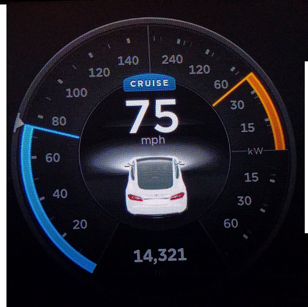
Okay for this viz I have some constructive feedback…
I should mention that I have a general disdain for radial type charts, however, that's not my main issue here. The main improvement I would make here is to adjust the colors. Generally, when I'm driving, I do not care so much about the energy use gauge on the right side, however, the bright orange always wins the battle for my attention.
Instead, I would change the colors to be focused more on the speed and make the colors for the energy use more subtle.
Navigation 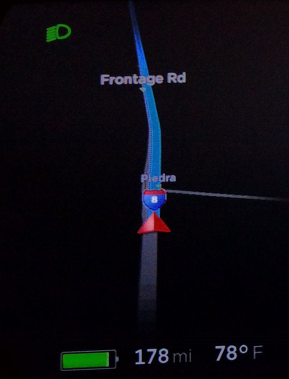
The navigation is pretty functional, and I get you don't want to clutter up the in-dash display. The only thing I would add is the upcoming turn so I know am I supposed to be in the right or left lane, or even what street I should be looking out for.
Map plus Range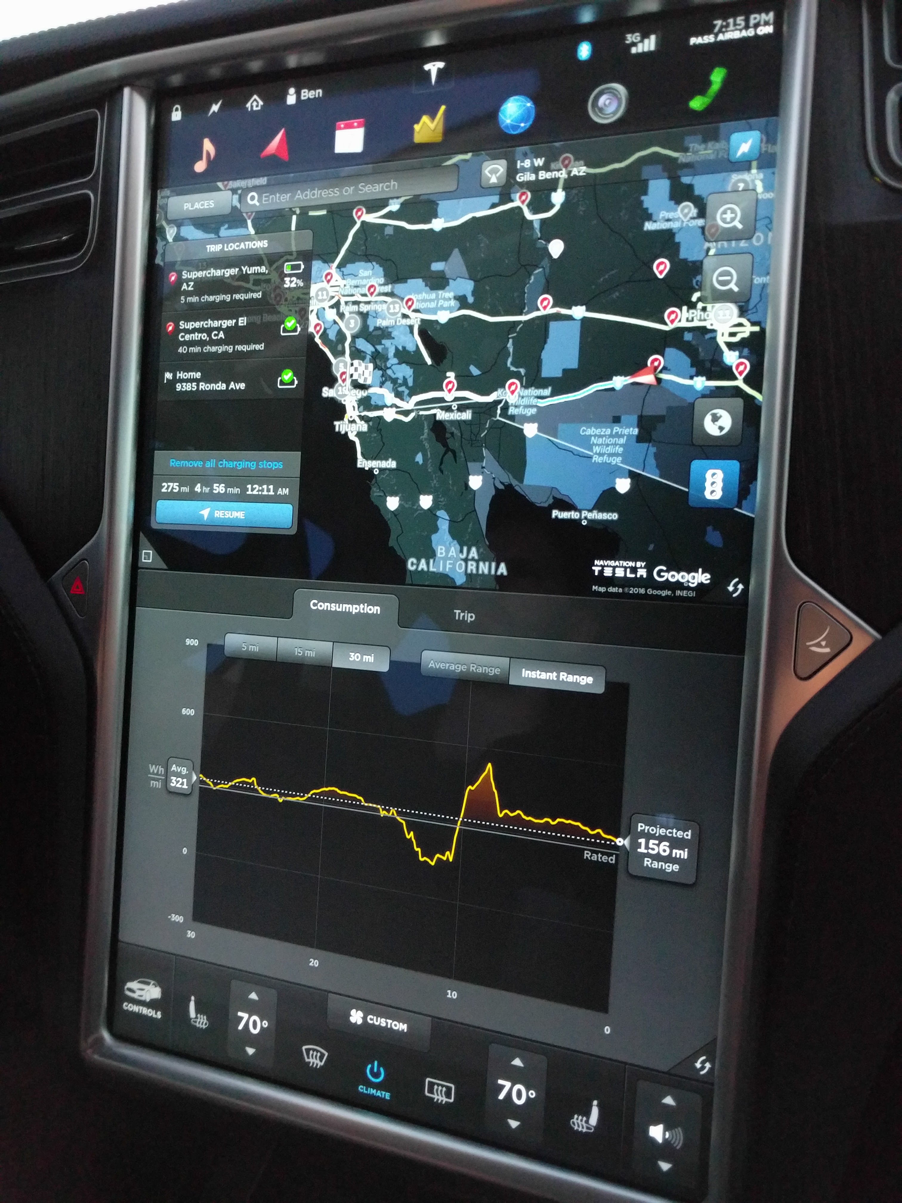
This is the full show with both the map with supercharger stations on top and the energy use below. On a recent trip back, where the bottom chart consistently played mind games with us, I watched this like a hawk trying to figure out if we would make it or not.
I know the car has that logic built-in, however, many times it seemed to fluctuate wildly giving my wife and a lot of anxiety.
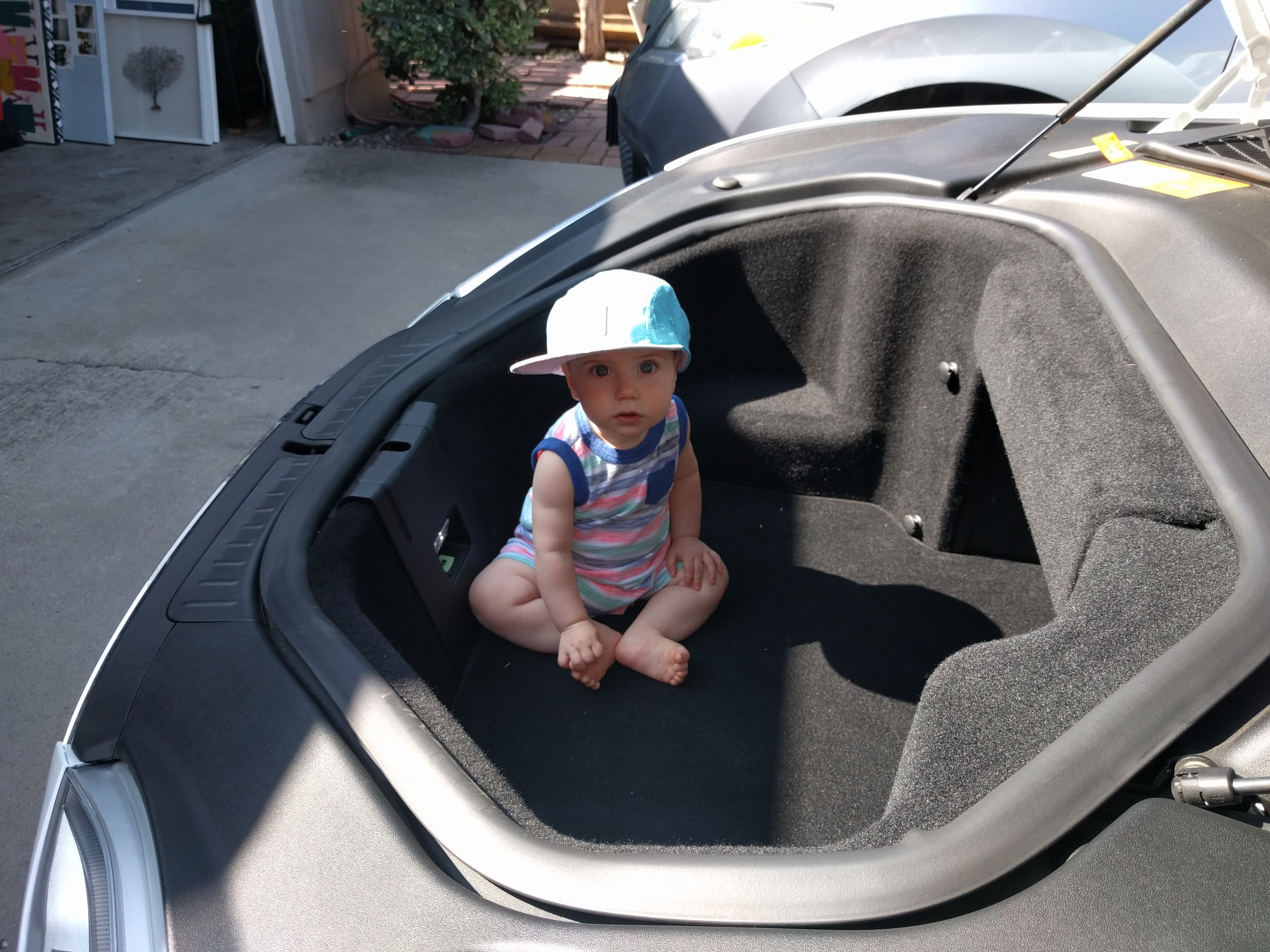
For the finale…here is a pic of my son playing in the frunk as he did many times while we waited at a Super Charger. While not a data viz, this is probably one of the coolest features in my Model S.
Thanks Tesla for making such an awesome car and Elon for doing all the good things you do!
I like the article overall. However, I don’t have the same disdain for the radial graph in this instance. I think it fits because Tesla are trying to make this fairly radical car familiar. All cars have radial graphs in the form of a tach or speedometer. They are just modeling that to remain familiar.
The only issue I really have w/ the radial graph is the right side. The energy use part constantly jumps up and down while driving which can be distracting. I think it’d make more sense to just keep to one gauge and change it’s color by how much energy is being used. Simpler yet still showing the same data.