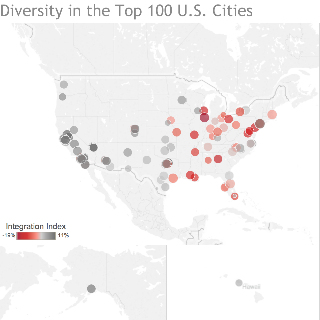
This weeks Makeover comes from a post by FiveThirtyEight on diversity in the United States among the top 100 largest cities. Mostly, the article describes how many cities with high amounts of diversity also are the least integrated. They use the term “segregated” however I prefer integrated to explain the same basic concept.
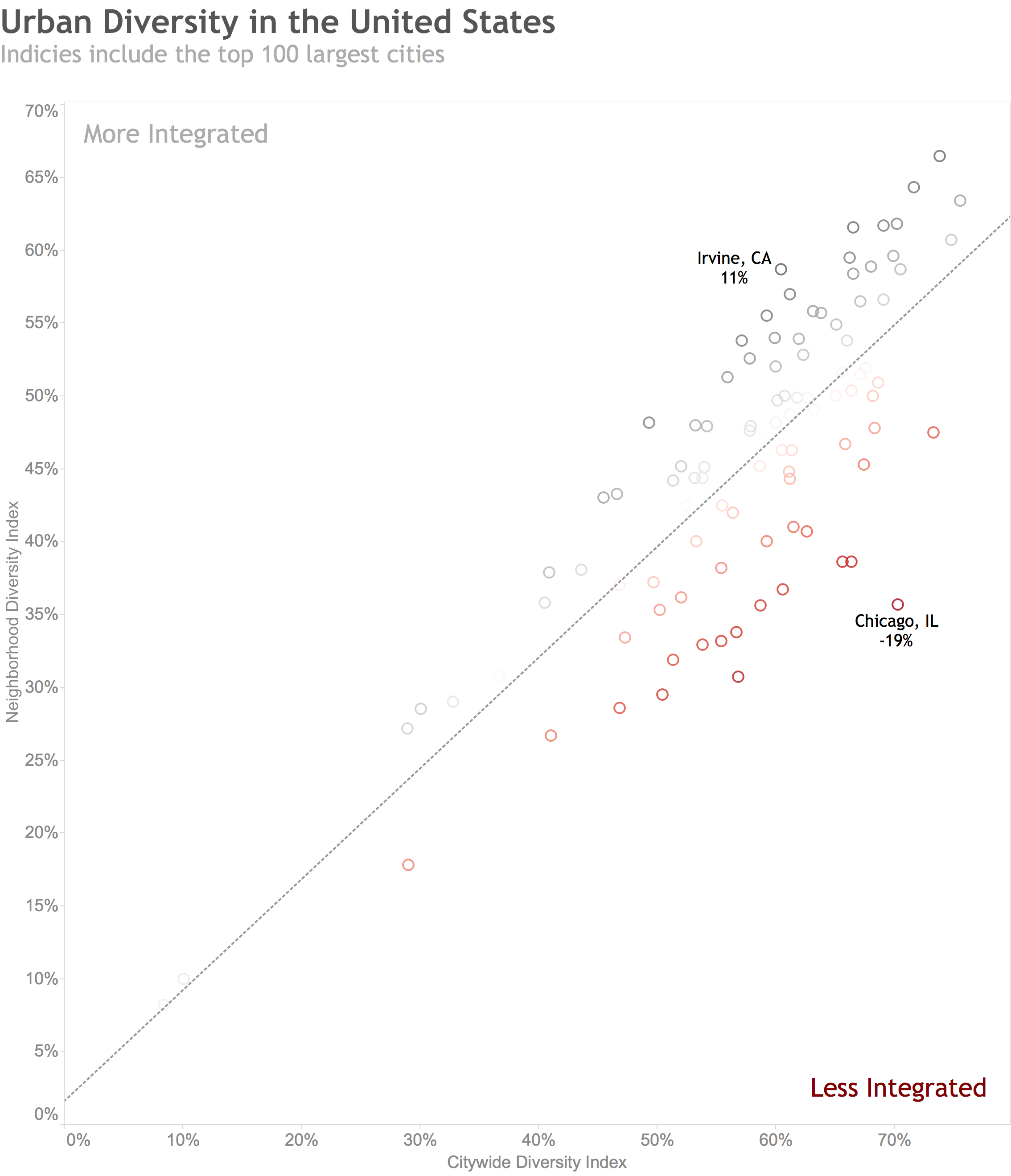
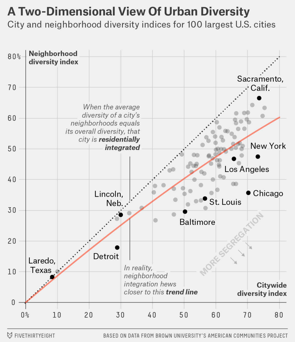
In their scatterplot they do a great job of highlighting the basis for their analysis and how they came to this conclusion. I do like this chart, a lot, however I feel there is too much chart junk on this example since there is an entire editorial explaining it's context.
Here is my before and after of this chart. My main approach in this makeover was to reduce the chart junk and clean up the data visualization itself. After I explored the data some more I found something else interesting which I've posted below the makeover as well.
*move the orange slider to see the before (right side) and after (left side)
My finding I thought was interesting while exploring this data was how the older cities on the east cost of the United States seemed to have a much lower ratio than the newer, west coast cities. Does this indicate better sings of societal evolution? Is it the laid back west coast vibe? What is it that explains why west coast cities are far more integrated than east coast cities? That…would be a great topic to explore.
*click the image to open an interactive version