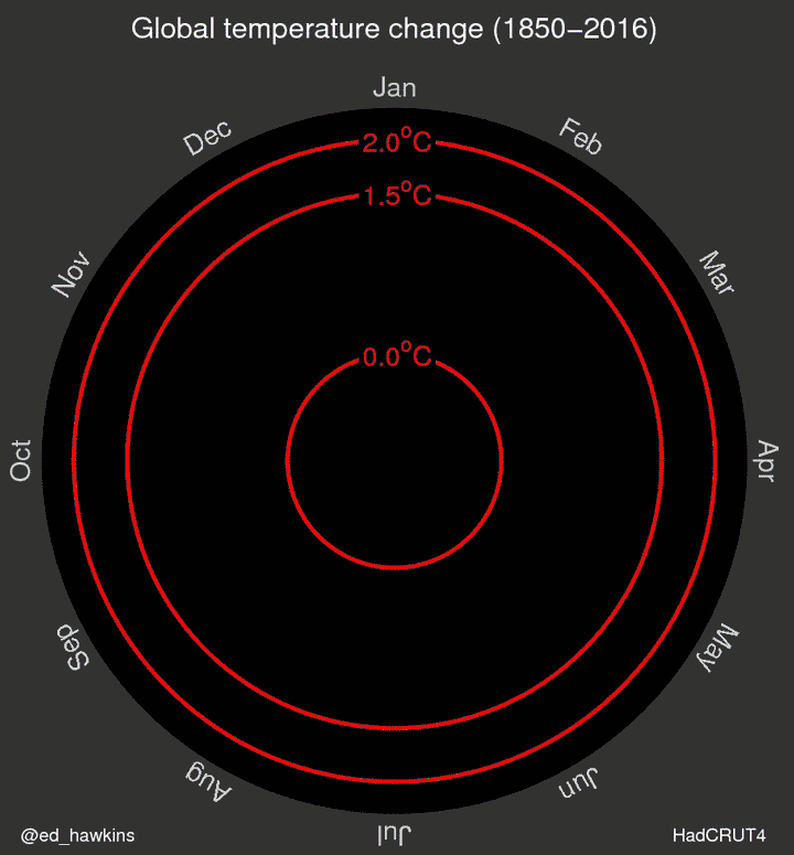
In this week's Makeover Monday I take a crack at Ed Hawkins wildly popular radar chart (link) showing how global temperatures have risen dramatically in recent times.
The data comes from HadCRUT4.4 (link) showing global temperatures relative to the mean from 1850 – 2016.
Ed's original visualization was really great in generating buzz, and I do feel accomplished its goal of illustrating the point that Global Warming is real and caused by humans. This isn't a typical phenomenon, and we have data to show it.
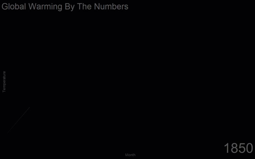
That being said, I just have a thing against radial type charts. So I took a crack at his original visualization (above).
I used a technique for animating this on the web with Tableau found here (How to Animate Your Tableau Dashboards on the Web) and recorded it with Snagit, then created the gif with Camtasia.
My Makeover Summary
- Lines vs Radar
- No reference lines
- Larger
- Different Colors (credit: colorbrewer.org)
tl;dr version
I chose a line chart over a radar chart as it's much easier to see the trends over time. I removed the reference lines since they, in this case, mostly added chart-junk. I made the graphic larger trying to fill the screen with data. Lastly, I chose a different color pallet more suited towards a cold v hot theme and found a good example on Color Brewer.
Ed's Original Visualization (source)
I have noticed you don’t monetize bensullins.com, don’t waste your traffic, you can earn extra cash every month with new
monetization method. This is the best adsense alternative for any type of website
(they approve all sites), for more details simply search in gooogle: murgrabia’s tools